Minimalist web design focuses on the essentials: clear structures, ample white space, and purposeful use of colors, typography, and images. By deliberately omitting unnecessary elements, a clean, calm website is created that guides the visitor’s eye. Minimalist design builds trust because it conveys clarity, order, and modernity. Users can find what they’re looking for faster and stay longer on the site. This design philosophy embraces conscious “less” that ultimately results in “more” impact, focus, and user satisfaction.
Why less is often more
Minimalism is not a restriction but a choice to focus on the essentials. When distractions are reduced, content and messages take center stage. "Less" here doesn’t mean "empty," but "well-structured." A harmonious layout, sufficient white space, and a purposeful color scheme create room for what matters: the user experience.
- Better user guidance: Visitors navigate more intuitively, finding content quickly.
- Focus on content: Key messages are communicated clearly without visual distractions.
- Faster loading times: Fewer graphics and scripts reduce load times – a plus for SEO and user-friendliness.
- Professional impression: Clean, organized design appears modern, trustworthy, and competent.
Best Practices for Minimalist Web Design
1. Use white space effectively
White space is not unused space but a key design element. It provides balance, calmness, and readability. Well-placed spacing between text, images, and modules guides the user’s eye and improves content comprehension. Too little spacing can feel cluttered and strain the eyes. A good minimalist design thrives on conscious emptiness between elements.
2. Limit the color palette
A reduced color palette is a hallmark of minimalist design. Use no more than two or three primary colors aligned with the brand identity. Color should always serve a purpose – to attract attention or evoke emotions. Background colors should be subtle and harmonious, while accent colors highlight important elements.
3. Keep typography clear
Typography is the backbone of readability. Clear, legible fonts convey professionalism and structure. Ideally, combine a main font for body text with an accent or heading font. Avoid too many fonts – they break visual unity. Generous line spacing and contrasts also enhance readability, especially on mobile devices.
4. Remove unnecessary elements
Every element on a website should have a function. If an icon, graphic, or animation has no clear added value, remove it. This keeps focus on content and user guidance. Minimalism is a conscious choice for functionality and elegance. Animations can be used selectively to enhance interactivity – but subtly, not dominating.
5. Prioritize content
Important information should appear at the top. Users scan pages quickly – key points must be immediately visible. Secondary content or details can be placed on subpages or hidden in expandable sections. This keeps the page uncluttered and avoids overwhelming the user. A clear content hierarchy is key to success.
Avoid common mistakes
Minimalist design leaves no room for carelessness. Too much white space without structure feels empty, too little spacing feels cramped. Unclear navigation or too many fonts disrupt the overall harmony. Every choice – color, spacing, or typography – should be intentional.
- Too much white space without structure
- Unclear navigation
- Excessive use of fonts or colors
- Hiding important content
Conclusion
Minimalist web design is not synonymous with boring. On the contrary – it creates clarity, strengthens the brand, and ensures a positive user experience. At aurelix, I ensure every design choice makes sense and that the website remains modern, fast, and intuitive. Less distraction, more impact – that is the art of minimalism in the digital space.
Further Resources
- NN/g: The Characteristics of Minimalism in Web Design — an in-depth look at the features of minimalist web design.
- Toptal: Simplicity Is Key – Exploring Minimal Web Design — practical guide with tips and examples.
- Awwwards: Minimal Website Designs
Websites for Animation & Inspiration
To add subtle motion to your minimalist web design, you can integrate animation libraries like WOW.js or Animate.css. These tools bring dynamics without cluttering the page. It’s important to use animations purposefully – to guide attention or emphasize interactions. Minimalist motion never replaces clear design; it complements it subtly.
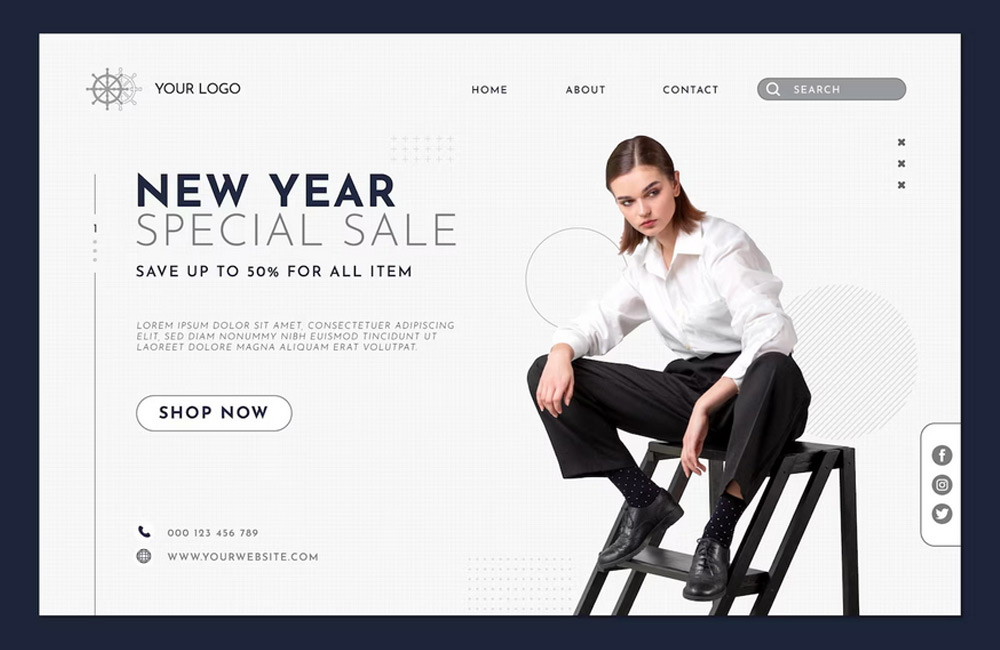
Image: freepik.com