Hover effects and small micro-interactions are the secret ingredient of modern web design. They add dynamics to websites, make actions more understandable, and create an emotional connection between the user and the interface. But as always, less is more. The art lies in using interactions intentionally and purposefully.
What Are Hover Effects?
Hover effects are visual reactions triggered when the mouse pointer moves over an element—for example, when a button changes color, an image slightly enlarges, or a text link becomes underlined. They give users feedback and indicate that an element is clickable or triggers an action.
Why Hover Effects Matter
- Feedback: Users immediately recognize that an element is interactive.
- Focus: Hover effects direct attention to important areas.
- Emotion: Motion creates liveliness and subtly supports brand identity.
- Usability: Well-placed effects make interaction more intuitive.
Best Practices for Hover Interactions
1. Function Before Effect
A hover effect should always serve a purpose—improving user guidance or clarifying clickable areas. Over-the-top animations distract and can quickly look unprofessional.
2. Subtlety Is Key
Use small, smooth transitions. A slight color change, a soft shadow shift, or minimal scaling is often enough to create a pleasant user experience.
3. Maintain Consistency Across the Site
If a button darkens on hover on one page, it should behave the same everywhere. Consistent effects build recognition and trust.
4. Think About Mobile Users
On smartphones, there is no “hover”—the first finger tap counts. Design interactive elements so they are clear and usable even without hover effects. A good responsive layout supports both modes.
5. Timing and Animation Duration
Apply transition effects thoughtfully. A duration of 0.2–0.3 s feels natural and pleasant:
button {
  background-color: #3B82F6;
  color: white;
  border: none;
  padding: 10px 20px;
  transition: all 0.3s ease;
}

button:hover {
  background-color: #2563EB;
  transform: translateY(-2px);
  box-shadow: 0 4px 8px rgba(0,0,0,0.1);
}
6. Make Smart Use of Micro-Interactions
Beyond hover effects, small animations for clicks, form validation, or loading states can enhance user experience. Ensure they remain subtle and don’t distract from the content.
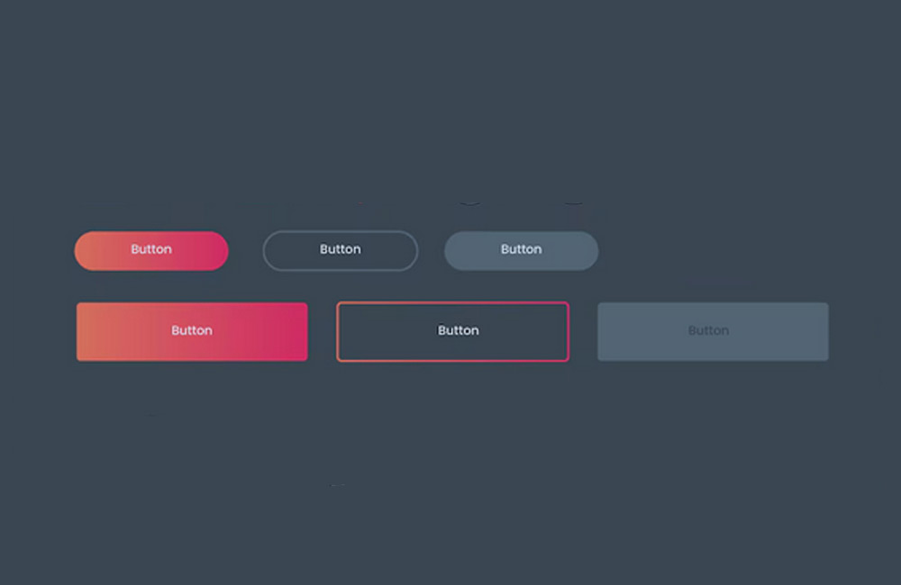
Examples of Good Hover Effects
- Buttons that slightly “lift” when hovered
- Images that gently zoom in or darken
- Icons that rotate or change color
- Links that underline or change color
Mistakes to Avoid
- Too many animations at once
- Nervous or blinking effects
- Effects without clear purpose
- Inconsistent hover styles across pages
Conclusion
Hover effects and micro-interactions make websites lively and intuitive—when used consciously. They are powerful tools for designers and developers to guide users through a page. At aurelix, I ensure design and function work in harmony: effects that enhance without overwhelming.
Further Resources
Image: freepik.com