The header is the first thing visitors see on your website – and often the last before they decide whether to stay or leave. A strong header can be the difference between “clicking further” and “bouncing away.” It is your first visual impression and should immediately convey clarity about your brand and your offer. A well-designed header sparks interest, builds trust, and motivates visitors to stay. Users often decide within seconds whether they consider your page relevant – the header plays a crucial role in that decision.
1. Clear structure and recognisability
Your header should instantly show who you are and what you offer. Your logo belongs on the left, navigation in a clearly visible area. Keep everything organised, consistent, and true to your brand – this creates trust and orientation. A clear hierarchy, readable typography, and matching colours help visitors find their way quickly. Brand recognition in the header makes it easier for users to remember you and strengthens brand loyalty.
2. Meaningful headline or USP
A short, concise sentence above your header image or next to your logo can make all the difference. Describe in a few words what makes you unique or what problem you solve. This way visitors instantly understand why they should stay. A strong headline can also act as a key message repeated across your pages. It should be emotionally appealing, clearly communicate benefits, and spark curiosity.
3. Highlight your Call-to-Action (CTA)
A clear call to action – such as “Get in touch now” or “Free consultation” – should be prominently placed in the header. Ideally in the top-right corner or as a button in the hero section. Avoid too many CTAs that distract. The CTA should clearly communicate the benefit and motivate visitors to take the next step. Colour, size, and shape all play a role in making it stand out and inviting interaction.
4. Hero section with emotion and relevance
Use a strong, authentic image or a short video in the header section. It should evoke emotions and match your target audience. Avoid overly generic stock photos – real, genuine images make your brand more relatable. The hero area can also include powerful text to convey key messages right away. Subtle animations or a short storytelling video can further increase attention.
5. Responsive and minimalist
Your header must work perfectly on every device – from desktop to smartphone. Pay attention to clear typography, enough contrast, and simple navigation. Less is often more: a calm header amplifies your message. A minimalist design reduces distraction and directs focus to what matters most. Mobile users especially benefit from clear structure and fast loading times.
6. Bonus: Sticky header for better usability
A “sticky header” that stays visible while scrolling can greatly improve usability. Visitors can always return to the menu – particularly useful on long pages or blogs. Sticky headers improve orientation and ensure important CTAs remain accessible. They contribute to a professional appearance and increase interaction on the website.
Conclusion
A well-designed website header is much more than just a title and a menu. It is your digital first impression – the business card of your brand. With clear structure, emotional design, and strategic calls to action, you create orientation, trust, and attention. Visitors are guided toward the most relevant content, increasing conversion rates. A professional header connects design, branding, and user guidance into a powerful tool for your online success.
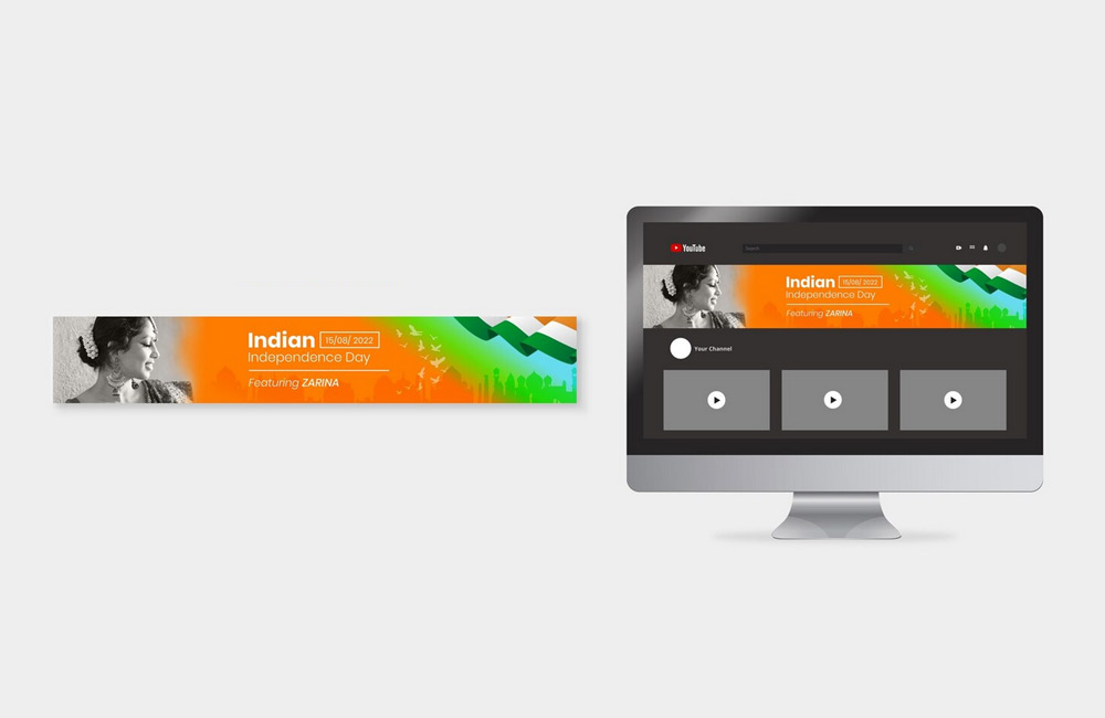
Image: freepik.com