Call-to-actions (CTAs) are essential elements on any website, guiding visitors toward specific actions — whether it’s making a purchase, signing up, or downloading something. A poorly placed or vaguely phrased CTA can cost you valuable conversions, directly impacting business success. With the right strategy, clicks, leads, and revenue can increase significantly. A CTA is not simply a button — it’s a deliberate element of user guidance. The clearer the benefit is communicated, the better visitors respond.
Why CTAs Matter
CTAs play a key role in directing visitors through your site and offering clear orientation. Without explicit action cues, many users remain passive — even when they are genuinely interested. A well-placed CTA can provide the final push needed to convert a visitor into a customer. CTAs are also measurable, offering valuable insights into user behavior. Analyzing clicks, placement, and color variations allows precise optimization over time.
- Guide users: They provide clear action cues and help structure navigation.
- Boost conversions: Optimized CTAs can directly increase your website’s success metrics.
- Measurable: Click data provides actionable insights for ongoing improvement.
Best Practices for Effective Call-to-Actions
1. Use Clear and Active Language
CTAs should be phrased clearly and describe a specific action, such as “Download Now,” “Start Free Trial,” or “Get Your Offer.” Visitors respond better to formulations that combine action with value. Passive language generates less motivation and is easily overlooked. Clear phrasing also prevents misunderstandings — especially important on mobile devices.
2. Place CTAs Where They Are Seen
CTAs should be placed where users can see them immediately — ideally above the fold and at the end of relevant sections. Visitors shouldn’t have to search for the next step. Strategic placement improves flow and increases conversion without interrupting reading. Multiple CTAs are useful on long pages as long as they match the context.
3. Use Color Psychology
Colors significantly influence decision-making. A CTA that visually stands out from the design is noticed faster and clicked more often. High-contrast colors increase visibility, while harmonious tones build trust. Depending on the brand, different tones trigger different emotions. A calm layout often benefits from a stronger accent color.
4. Communicate Urgency & Value
Phrases like “Limited time only” or “Claim your benefits now” create urgency. People react more strongly when they feel they may miss out. At the same time, always communicate the value the user receives by clicking. Urgency without benefit feels manipulative and harms trust. Combining both increases conversions significantly.
5. Consider Size, Shape & Spacing
Buttons should be large enough to stand out but not so large that they disrupt the layout. Proportions, readability, and spacing influence usability — especially on mobile devices. Rounded corners appear modern and friendly, while angular shapes convey structure. Your button style should match your brand identity.
6. Optimize for Mobile Devices
On smartphones, thumb-friendly placement is crucial — ideally in the lower third of the screen. Sticky buttons that remain visible can dramatically increase clicks. Adequate touch-area size, fast loading, and responsive design are key to mobile conversion.
7. Run A/B Tests
A/B testing shows which CTA or landing page variant performs better. Even small differences — color, text, size, or placement — can significantly affect results. Objective data leads to better decisions than intuition alone. Continuous testing results in ongoing improvement and better performance long-term.
Conclusion
An optimized CTA is more than just a button — it’s a core part of your entire conversion strategy. With clear wording, striking design, smart placement, and continuous testing, visitors can be guided effortlessly through your website. At aurelix, I combine design, psychology, and user experience to ensure every CTA delivers maximum impact.
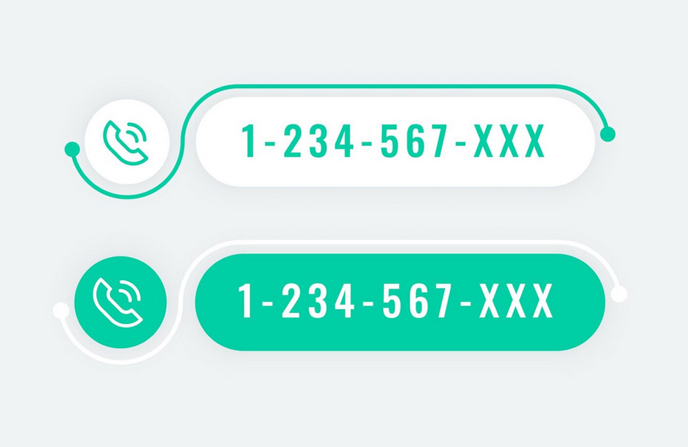
Image source: freepik.com