Color choice and typography are crucial for the first impression of a website. They influence readability, user experience, and the emotional impact of your content. A harmonious combination of fonts and color schemes signals professionalism and strengthens your brand identity.
Using Color Schemes Effectively
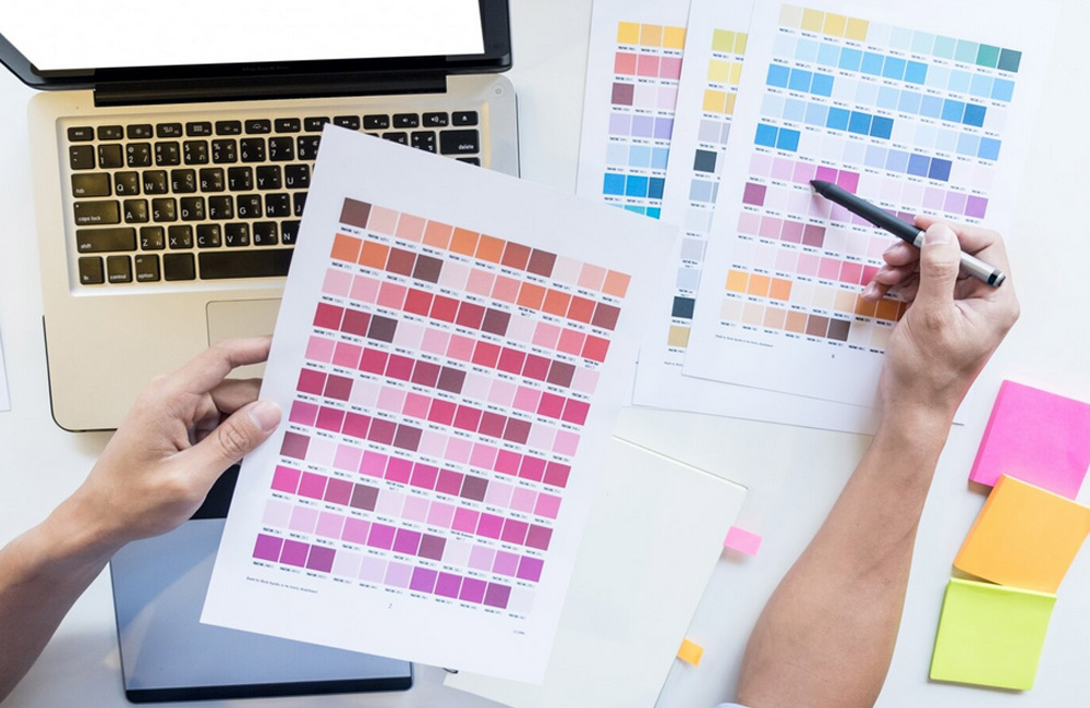
When creating a color scheme, pay attention to contrast, harmony, and psychological impact. Color palettes can guide visitors, evoke emotions, and encourage certain actions.
- Primary Color: Dominant for buttons, CTAs, and key highlights.
- Secondary Colors: Support the overall look, e.g., for backgrounds or sections.
- Accent Colors: For small, attention-grabbing elements like links or icons.
Colors That Often Cause Problems
- Colors that are too bright or neon, straining the eyes.
- Low-contrast combinations that impair readability (e.g., light yellow on white).
- Too many different colors, creating visual noise and weakening the brand.
- Unfitting combinations that trigger negative cultural or psychological associations.
Typography: Readability & Style
Font choice has a direct impact on user-friendliness. Modern websites often use:
- Sans-serif fonts for body text because they are easier to read online.
- Serif fonts for headlines or branding to convey elegance.
- Google Fonts or locally hosted web fonts to ensure legal safety.
- A maximum of two to three fonts to maintain consistency.
Tips for a Professional Look
- Choose colors that match your brand and support targeted emotions.
- Ensure sufficient contrast between text and background.
- Create a clear font hierarchy: headline, subheadline, body text.
- Use whitespace to structure content and provide visual breathing room.
- Combine typography and colors to guide users intuitively through the page.
Conclusion
Color schemes and typography are not just aesthetic decisions—they influence user experience, brand perception, and ultimately conversions. With conscious selection and harmonious alignment, your website will appear professional, clear, and inviting.
Image: freepik.com