Colors are much more than just a design element. They are emotional language, energetic vibration, and a central part of your brand identity. Even before someone reads your name or understands your offering, the color world of your brand speaks directly to the subconscious.
Whether logo, website, or social media – the choice of colors influences how people feel about your brand. Colors can build trust, convey clarity, spark excitement, or unconsciously create distance. That's why choosing them strategically and intuitively is just as important as aesthetics.
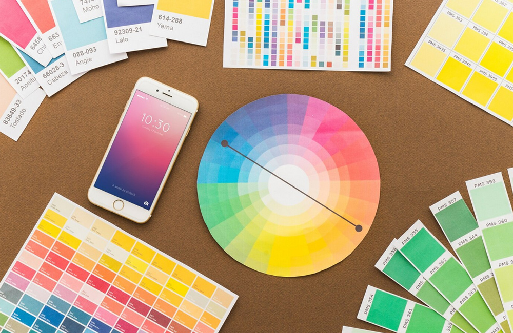
Colors Affect Emotions and Psychology
Every color carries symbolism and a frequency. In brand psychology, these effects are used to evoke desired emotions. A brief overview of basic meanings:
- Blue: Trust, calmness, professionalism – common in banking, tech, and health brands.
- Green: Nature, balance, growth – ideal for sustainability, coaching, or holistic concepts.
- Red: Energy, passion, attention – strong but dominant, use sparingly.
- Yellow: Optimism, creativity, joy – attractive, but too much can feel restless.
- Black: Elegance, depth, clarity – popular in luxury or design sectors.
- White: Purity, openness, space – creates visual calm and lightness.
- Purple: Spirituality, intuition, transformation – often chosen by conscious or creative brands.
Note: meanings may vary culturally – ultimately, what feels right for you and your brand matters most.
Color Psychology in Branding
Colors influence brand perception more than many realize. Studies show people make up to 90% of their spontaneous product and brand decisions based solely on color. Your palette is the first impression of your energy.
Conscious color choices strengthen brand identity. They combine visual aesthetics with emotional depth – ensuring your brand is recognized and felt. In logos, this is crucial: your logo accompanies your brand permanently, so it should be timeless, clear, and harmonious.
Color Choices on Websites – More than Design
On your website, it's not just about beauty, but guidance and balance. Colors direct attention, create structure, and influence how long visitors stay. Overly colorful or contrasting designs can feel chaotic, while too neutral layouts may seem boring.
Ideally, combine a primary color (your brand tone), an accent color (for buttons and highlights), and neutral base colors (white, gray, beige, sand, black) to anchor your design. This structure ensures recognition and calm.
Intuitive or Strategic – Best of Both
A strong brand emerges when strategy and intuition complement each other. Let your color choices reflect your inner brand energy: what frequency do you want to convey? How should people feel when visiting your site or seeing your logo?
Trusting your feelings while understanding psychological impact creates an authentic visual language – a brand that is not only seen but felt.
Conclusion: Colors are vibration, emotion, and strategy at once. They are the invisible bridge between your inner vision and external perception. Choose them consciously, lovingly, and with the awareness that they carry your message.
Image: freepik.com