A well-structured website layout ensures visitors can quickly understand content, navigate easily, and stay longer on your site. This increases dwell time, usability, and conversion rates. Clear structure not only creates order but also conveys professionalism and trust.
1. Intuitive Navigation
Intuitive navigation is the backbone of every successful website. Visitors must understand within seconds where to click to reach their goal. Avoid too many menu levels – aim for 5–7 main categories with clear labels. A transparent menu or sticky navigation can provide extra guidance. The clearer the path, the longer users stay – increasing the likelihood of conversion.
2. Logical Content Hierarchy
A good content hierarchy guides both visitors and search engines. Structure your content by importance – H1 for main headings, H2 for subtopics, and H3 for details. A clear visual rhythm ensures the reader feels guided. Clear structure also supports SEO rankings and improves comprehension of complex topics.
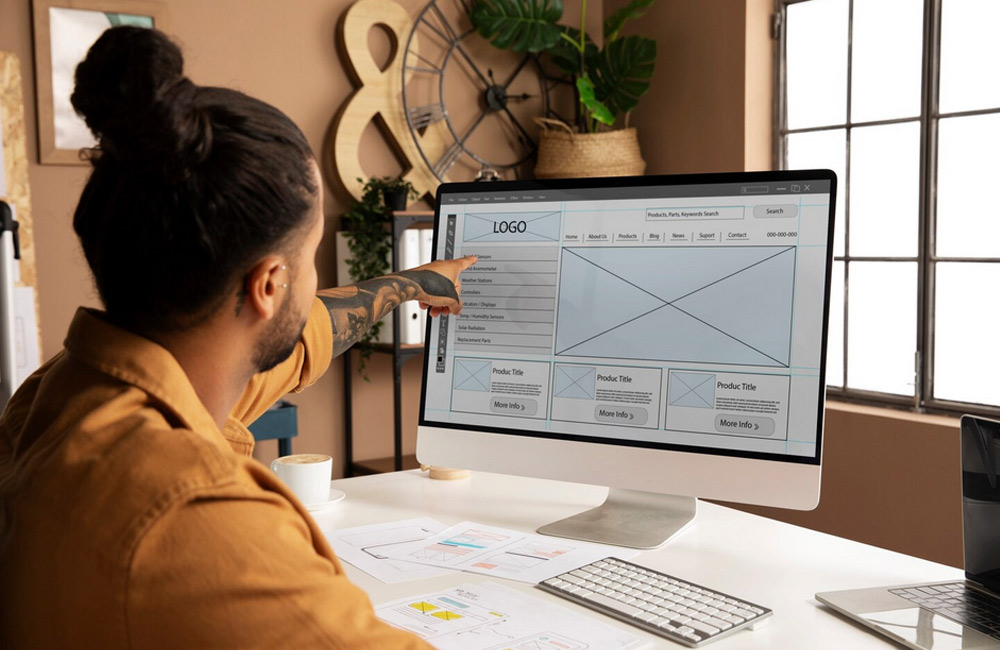
3. Structured Content
Structured content makes text more readable and engaging. Use paragraphs, subheadings, icons, info boxes, or images to guide the eye. The human brain loves patterns – avoiding wall-of-text content rewards readers with a better experience. The more enjoyable the reading, the higher the interaction and sharing.
4. Internal Linking
Internal links are a powerful tool to keep users engaged and strengthen SEO structure. Place relevant links to related articles or products where they fit contextually. This creates a cohesive information network that increases dwell time and helps Google understand relationships. Avoid over-optimization – quality over quantity.
5. Mobile-First Design
In today’s mobile world, Mobile-First is the standard. Over 70% of visitors use smartphones – if you lack clear structure here, you lose potential customers. Pay attention to white space, readable font sizes, and tappable buttons. A mobile-optimized structure reduces bounce rates, builds trust, and improves Google rankings.
6. Strategic Call-to-Actions (CTAs)
CTAs are signposts for visitors. Whether “Buy Now”, “Learn More”, or “Book Appointment” – they guide users to where you want them. Use contrasting colors and repeat CTAs in logical places on the page. A clear structure with properly placed CTAs can increase conversion rates by up to 50%.
7. Visual Hierarchy
Visual hierarchy ensures the eye naturally follows the most important elements. Use colors, contrasts, sizes, and spacing strategically to guide visitors. Good design “speaks” even without words. A thoughtful layout reduces bounce rates and increases trust in your brand.
Conclusion
Clear website structure is more than design – it’s strategy. Through intuitive navigation, logical hierarchy, internal linking, and targeted CTAs, you create a digital experience that engages and retains visitors. Understanding structure builds trust, clarity, and long-term success.
Image: freepik.com