A well-structured content layout not only improves the user experience but also boosts the visibility of your website in search engines. When your content is clearly organized, visually appealing, and logically arranged, visitors feel intuitively guided — and stay longer. A thoughtful structure is therefore not just a design question but a real conversion driver.
1. Start with the most important content
Place the most important information at the top of your page (“above the fold”), so visitors instantly understand what it's about. People decide within seconds whether to stay or leave — so your main message must be immediately visible. Think of your homepage like a magazine cover: headline, image, and core message spark curiosity. Use clear headings, concise statements, and a visible call-to-action (e.g., “Request now” or “Learn more”). A strong introduction captures attention and motivates users to scroll.
2. Use logical hierarchy
Structure is the foundation of any professional website. Use a clear information hierarchy with H1, H2, and H3 headings to organize topics. This helps readers and also helps search engines understand your content. Present information by importance: what visitors need first goes at the top. Lists, subheadings, and visual separators make text easier to digest. The better you guide the reading flow, the more memorable your message becomes.
3. Paragraphs and white space
Text blocks that are too dense discourage readers. Give your content room to breathe. Adequate white space increases readability and makes the design feel more premium. Studies show that users are more likely to read longer texts when they appear visually “light”. Use paragraphs to separate thoughts and keep each section focused. White space around call-to-action buttons also draws attention.
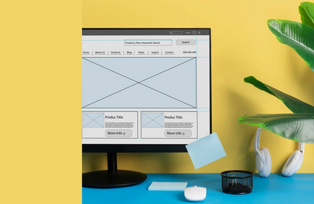
4. Use visual aids
Images, icons, and colors speak directly to the subconscious. Use visual elements deliberately to make content easier to understand. Icons help with orientation, and contrasting colors create focal points. Visuals should be strategic, not decorative. Infographics or illustrated explanations simplify complex content and strengthen emotional connection with your brand.
5. Place internal links smartly
Internal links act like small signposts across your site. They connect related content and strengthen the overall structure. A strong internal linking strategy improves SEO and increases the time visitors spend on your site. Place links where they truly add value — not randomly. For example, link to related articles or your portfolio within your blog posts.
6. Think mobile-first
More than 70% of users browse on mobile devices — so your website should be optimized for smartphones first. That means: clear structure, large buttons, short texts, fast loading times. Long or overly complex sentences do not perform well on mobile. Present content in small, digestible portions — for example with accordions, icons, or compact galleries. Test your site regularly on different devices.
Conclusion
Placing content correctly means aligning structure with aesthetics. If you prioritize key information, use hierarchy, create visual calm, and consider mobile users, you gain two things: satisfied visitors and better rankings. Every position of text or images communicates something about your brand — and shapes how professional you appear. Use placement consciously — and your website will feel more vibrant and effective.
Image: freepik.com