In a world overwhelmed by stimuli and information, minimalism in web design is becoming increasingly important. “Less is more” sounds simple, but good minimalist design requires clarity, courage to reduce, and a deep understanding of brand aesthetics and user guidance.
Minimalism Doesn’t Mean Emptiness
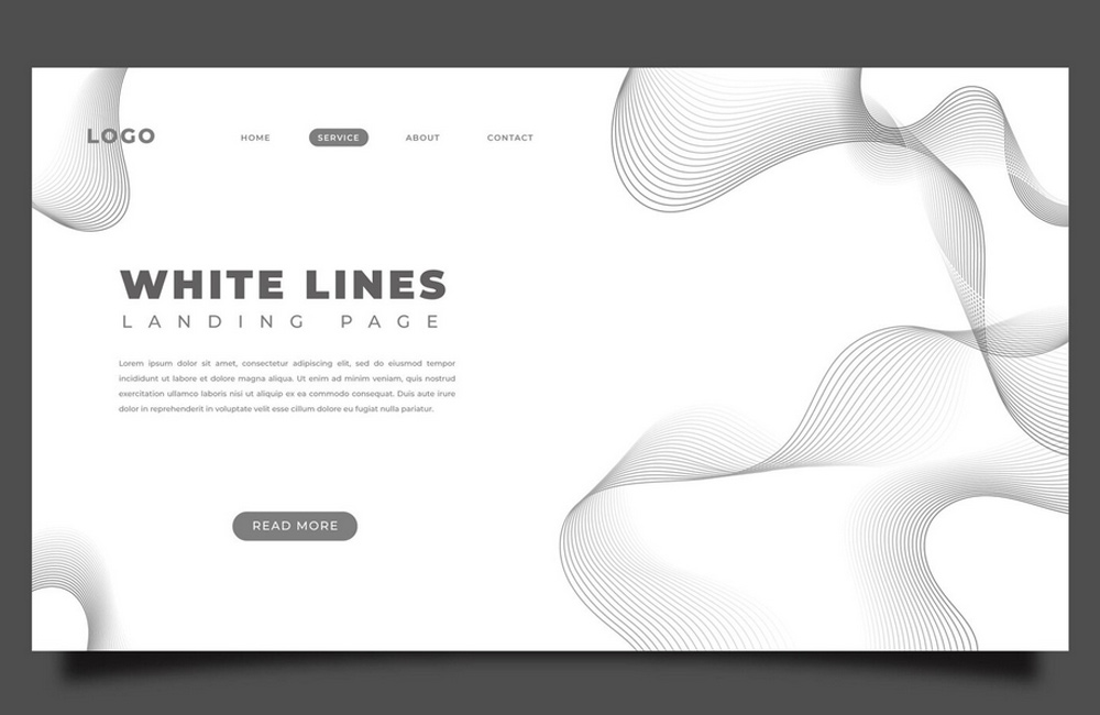
Minimalism is often mistaken for barrenness. It’s not about removing everything until nothing is left – it’s about showing only what truly matters. Every line, color, and space has a purpose. Good minimalist design communicates more with less.
Why Minimalism Builds Trust
A clean, clear website feels professional, confident, and deliberate. It gives visitors the sense: someone here knows what really matters. Less distraction means more focus on your message – and more trust in your brand.
Colors, Typography, and Whitespace
Minimalism thrives on balance. Thoughtful use of whitespace guides the eye, creates calm, and lets content breathe. Reduced color palettes and clear typography amplify emotional impact. Minimalist design is like a good composition – every element plays its role in harmony with the whole.
Fewer Visual Elements, More User Focus
An overloaded design may grab attention briefly, but rarely builds trust. Minimalist websites guide visitors intuitively – without unnecessary distractions or cognitive friction. The result: a better user experience and often higher conversion rates.
Minimalism and Brand Identity
A reduced design expresses the essence of your brand. When you clearly know who you are and what you stand for, visual effects aren’t needed to convince. Minimalism conveys maturity, confidence, and focus – values your audience feels intuitively.
Conclusion: Reduction as a Tool of Clarity
Minimalism in web design is not a trend but a mindset. It’s about awareness, authenticity, and clear communication. When every element on your website has meaning, a harmonious whole emerges that resonates – and stays with the user.
Image: freepik.com