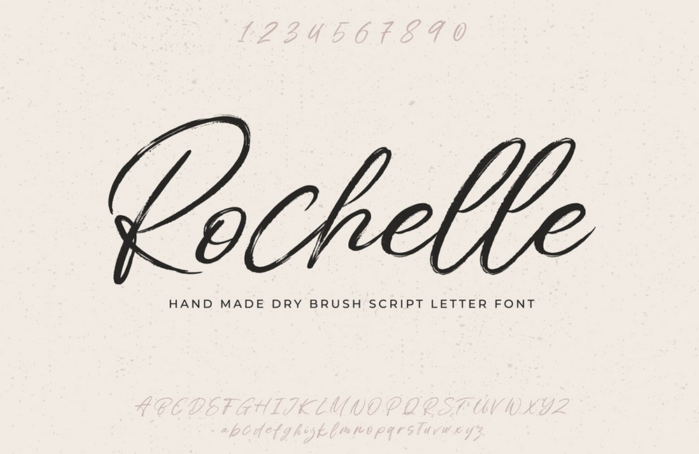
The choice of fonts is crucial for the first impression of your website. Modern fonts enhance readability, user-friendliness, and give your site style. Typography is not just a design element but part of brand communication – it evokes emotions, provides orientation, and subconsciously affects visitors' trust. A carefully chosen font can underline your message and visually convey your brand's character.
1. Why Fonts Matter
Fonts convey emotions, brand identity, and readability. The wrong font can deter users, while appealing typography improves user experience and builds trust. Every font has its own personality – it can appear serious, playful, modern, or traditional. Therefore, it’s important that it matches your company’s tone. Readability should always come first, because even the most beautiful font loses value if it’s hard to read. Consistent typography contributes to brand recognition and creates a harmonious appearance across all devices.
2. Beyond Arial and Times New Roman
Standard fonts are reliable but often boring. Google Fonts, Adobe Fonts, or system web fonts offer hundreds of options that suit your style. Using modern fonts allows you to give your website a unique look and clearly differentiate yourself from competitors. Trends today favor clean, geometric sans-serif fonts, which are readable on both desktop and mobile devices. Serif fonts are also experiencing a revival, as they convey elegance and credibility. The art is in combining style and functionality – “form follows readability.”
3. Using Google Fonts
Google Fonts are free, easy to integrate, and optimized for the web. They offer a huge variety of styles, weights, and variants. Popular options:
- Roboto: Modern, clean, and versatile
- Open Sans: Highly readable for body text
- Lato: Elegant and professional
- Montserrat: Perfect for headlines
Integration is simple via the <link> tag in the <head> or CSS @import. They are immediately usable without additional software. It is important to load only the font styles you really need – this reduces loading times. More information can be found at Google Fonts, where you can test, combine, and integrate fonts directly. This way you combine design freedom with performance and security.
4. Choosing Font Combinations
Use a maximum of two to three fonts: for example, one for headlines and one for body text. Pay attention to contrast, harmony, and readability. A common mistake is using too many fonts, which creates a cluttered and unprofessional look. Well-chosen combinations create visual hierarchies and guide the user's eye intuitively through the page. Tools like Google Fonts or Font Pair can help in selecting suitable pairs. If in doubt, stick to classics – they are proven, stylish, and work on almost all devices.
5. Consider Readability and Web Standards
Size, line height, contrast, and letter spacing greatly influence readability. Sans-serif fonts are excellent for screen text, while serif fonts are ideal for headings or print-like designs. Ensure sufficient line spacing and contrast values – this is especially important in responsive design. Text that is too small or dense can quickly tire visitors. Use font weight and color strategically to create structure and focus attention. If you work with screen readers or accessibility, follow web standards (WCAG) to provide an optimal experience for all users.
6. Keep Performance in Mind
Too many external fonts can slow down your site. Load only the variants you need and use modern formats like WOFF2. Every millisecond counts, especially for mobile visitors. Fast page load improves user satisfaction and indirectly boosts your SEO ranking. If possible, host fonts locally – this increases privacy and loading speed. Remember: performance is not just technology but also user experience. An optimized font strategy intelligently combines design aesthetics and technical efficiency.
Conclusion
Fonts are an underrated but powerful design element. With modern fonts, clear combinations, and high readability, you can visually enhance your website, retain users longer, and strengthen your brand. Experiment with styles but stay true to your brand identity. Typography is your brand's voice – it speaks before a word is read. Google Fonts and other web fonts make it easy to design professionally and individually, without technical hurdles. In the end, it’s not about how fancy a font is, but how it conveys your brand message – clearly, authentically, and recognizably.
Image: freepik.com

