Web design is much more than aesthetics – it directly influences how visitors feel, act, and make decisions. Every color, symbol, and button operates on a subtle psychological level. Good design guides the eye, builds trust, and strengthens brand loyalty. To fully leverage its impact, web design requires a clear structure and purposeful layout that combines emotion and logic.
1. The Impact of Colors
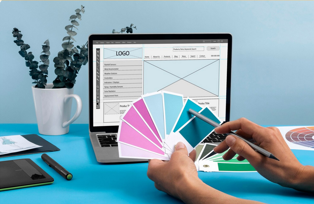
Colors speak the language of emotions. They subconsciously evoke feelings, influence moods, and convey brand values. Blue represents trust, security, and professionalism, red stands for energy, passion, and action, green for calm, nature, and health, and orange for joy and activity. A well-thought-out color scheme is no accident; it results from psychological insight and deliberate branding strategy. Less is often more: Too many colors can confuse, while a harmonious palette guides the eye and creates orientation.
For further inspiration, see for example the article Color Theory in UX Design.
2. Buttons and Call-to-Actions
Buttons bridge interest and action. Their shape, color, and placement influence whether someone clicks or scrolls past. A prominent, high-contrast call-to-action button draws attention and provides guidance. Texts like “Discover Now” or “Try for Free” speak directly to the subconscious and encourage decision-making. Ensure buttons remain consistent – same shapes, colors, and spacing foster recognition.
More on conversion optimization can be found at Optimizely – Call to Action.
3. Layout and Visual Hierarchy
A good layout tells a story – clear, intuitive, and structured. User attention follows patterns, such as the “F-layout,” where important information starts at the top left. Headings, paragraphs, and white space provide orientation, while guided eye movement highlights key content. Core messages and calls-to-action should be visible “above the fold” – without scrolling.
A clear structure builds trust, reduces bounce rates, and makes content appear more professional. For deeper insights, see Nielsen Norman Group.
4. Consistency and Recognition
Consistency builds trust. When colors, fonts, and spacing are uniform, visitors perceive your brand as reliable. Inconsistent design can subconsciously create confusion or distrust. Recognition is a key success factor – it connects users emotionally with a brand. Ensure your branding remains consistent across platforms (website, social media, newsletters).
Inspiration can be found here: How Consistency Strengthens Brands.
5. Psychology in Combination
Successful web design is a harmonious interplay of psychology, structure, and emotion. Colors guide attention, buttons trigger action, and layouts direct the eye. The more naturally users are guided through your site, the higher the conversion. Thoughtful design addresses both subconscious and conscious perception – turning random clicks into intentional decisions.
Conclusion
Colors, buttons, and layout are the invisible architects of a website. Used consciously and strategically, they create trust, emotion, and engagement. A harmonious design is not loud but clear – it guides, inspires, and strengthens brand awareness. Professional web design aligns psychology, aesthetics, and technology – and ultimately determines whether visitors stay or leave.
Image: freepik.com