Barriers on your website prevent visitors from consuming content or completing desired actions. Identifying and removing them increases engagement, user satisfaction, and conversions. Even small obstacles can make potential customers leave or get frustrated. A good website feels easy, smooth, and intuitive for visitors. The fewer resistances exist, the stronger user retention and the more successful your digital offering becomes.
1. Common Website Barriers
Many websites lose visitors due to unintentional stumbling blocks. Often small issues make the difference: slow loading times, confusing menu structures, or pop-ups appearing in the middle of reading. These elements break attention and create resistance. Too small font sizes, weak contrasts, or unreadable colors can also subconsciously deter visitors. Additionally, cluttered pages appear unprofessional and overwhelm the eye. Clear, calm design is usually more effective than many effects or blinking animations.
- Slow loading times frustrating users
- Unclear navigation or too many menu items
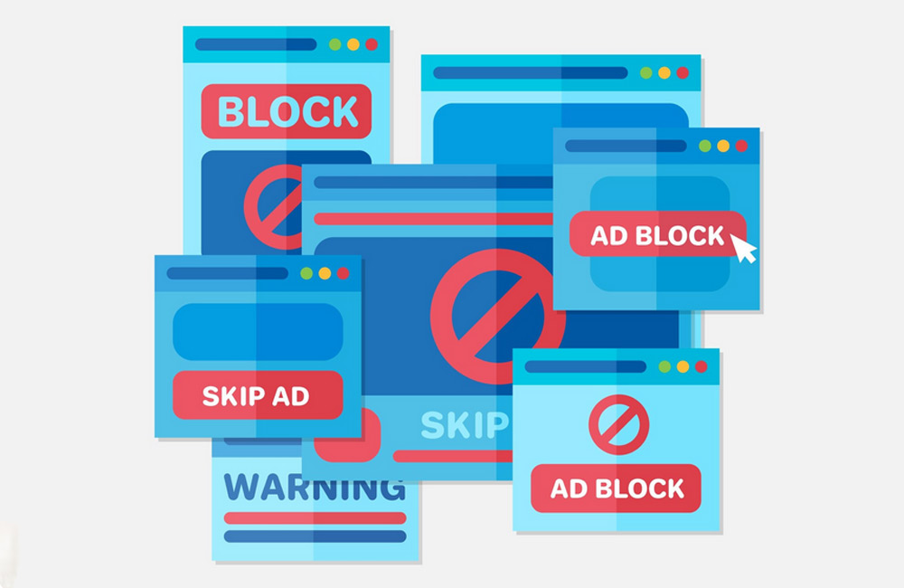
- Pop-ups, banners, or autoplay content that distract
- Poor readability due to inappropriate font sizes or contrasts
- Missing mobile optimization
- Forms with too many required fields or complicated logic
- Unclear or unstructured content
2. Analysis and Detection
Before optimizing, you need to know where the problems lie. Tools like Google Analytics, Hotjar, or Microsoft Clarity help visualize visitor behavior. Heatmaps show which areas are frequently clicked or ignored. Scrollmaps reveal how far users actually scroll. Session recordings provide insights into where users hesitate or leave. These data points are crucial for targeted actions rather than optimizing blindly.
3. Optimization Tips
Removing barriers is an ongoing process. Start with the biggest levers: loading times, structure, and readability. Compress images, optimize code, and use caching to speed up pages. Clear, intuitive navigation is essential – visitors should always know where they are and how to proceed. Reduce disruptive pop-ups and ensure good readability with comfortable contrasts. For forms: as short as possible, as simple as necessary. Structure content with meaningful headings, paragraphs, and lists to make it easily digestible.
- Improve loading times with compressed images and optimized code
- Simplify navigation: clear structure, logical menu items
- Reduce pop-ups and disruptive ads
- Increase readability with suitable font sizes, line spacing, and contrasts
- Implement responsive design for all devices
- Shorten and simplify forms for better user experience
- Structure content: headings, paragraphs, bullet points
4. Testing and Monitoring
Optimization never ends – it’s a continuous cycle. After each adjustment, check how user behavior changes. A/B tests allow you to compare layouts, button colors, or text formulations and make data-driven decisions. Even small changes – like a different CTA text or more whitespace – can have a big impact. Monitor conversion rates, bounce rates, and dwell time regularly to ensure a consistent, barrier-free experience. A website is not static; it’s a living system that should grow with your visitors’ needs.
Conclusion
Website barriers directly affect user experience and success. They are often invisible but noticeable – in frustration, bounces, or low conversions. Regular analysis, testing, and optimization create a website that not only looks good but functions intuitively. Barrier-free, user-friendly design keeps visitors engaged, builds trust, and encourages action. At aurelix, I combine technical optimization, UX design, and psychological user guidance to create websites that convince and perform sustainably.
Further Resource
Image: freepik.com