The structure of your homepage significantly determines whether visitors stay longer, explore, or become customers. A clear hierarchy, well-placed content, and an intuitively designed navigation are crucial to guide attention and increase time on site. A good structure is like an invisible thread, leading visitors seamlessly through your site. It ensures people navigate intuitively, build trust, and engage more deeply with your content.
Why homepage structure matters
- First impression: Visitors decide within seconds whether to stay or leave.
- User guidance: Clear structures help find content quickly.
- Conversion: Good structure guides visitors to key actions like contact, purchase, or sign-up.
- SEO: An organized structure helps search engines index your content.
Your page layout is not just a design topic; it's a strategic success factor. The first impression affects trust. A well-structured homepage creates orientation by clearly conveying the "why," "what," and "how" of your offering. It appeals to the eye, mind, and emotion simultaneously. Google also favors logical hierarchies, boosting your visibility in the long term.
Best practices for an engaging homepage
1. Clear header with key information
The top section is your brand's showcase. It should include logo, navigation, and a concise core message. A clearly formulated slogan or USP immediately shows visitors what the site is about. Visitors want to know within seconds: "Am I in the right place?" or "What’s in it for me?". The header is your chance to establish trust and orientation. A call-to-action in the header, like "Contact us now" or "Learn more," can significantly increase conversions.
2. Visual hierarchy
Our eyes follow patterns – large, high-contrast elements attract attention first. A clear visual hierarchy ensures key content is immediately noticed. Use colors, sizes, spacing, and typographic contrast to guide reading flow. Reduce visual noise; fewer competing elements lead to more focus and better user experience.
3. Logical content sections
Organize your homepage into clear sections like benefits, services, testimonials, and CTAs. Each section should have its own purpose and be visually separated. Use headings, icons, and harmonious color blocks to create orientation. Clear structure keeps visitors engaged longer and encourages action.
4. Simple and intuitive navigation
Navigation is the backbone of every website. Clear labels, shallow menu levels, and a simple structure help visitors find their way. Avoid cryptic terms or too many submenus. A sticky menu improves UX by remaining visible during scroll. Visitors should always know where they are and how to return. Good navigation is like a compass – invisible but essential.
5. Prominent call-to-actions
A call-to-action (CTA) is the heart of your conversion strategy. Well-placed and clearly visible buttons guide visitors to the desired action. Experiment with colors, texts, and placement. Phrases like "Request your offer now" are stronger than generic "More info". Repeat CTAs at strategic points without overwhelming users. Rule of thumb: One goal per page.
6. Mobile optimization
Over 70% of website visits are now on smartphones. Your site should impress on mobile as well as desktop. Touch-friendly buttons, fast loading, and compact layouts are essential. Test your homepage with tools like Google Mobile-Friendly Test to ensure a great mobile experience. Mobile usability is now standard, not optional.
7. Include trust elements
Trust is the currency of the internet. References, client logos, badges, and reviews build credibility and lower barriers to contact. Show real people, team photos, or awards – they are more effective than sterile icons. Social proof, like Google reviews or testimonials, strengthens trust. Combined with consistent design, this creates a professional impression that reinforces your brand.
Common mistakes
- Cluttered homepage without clear structure
- Important information too far down
- Unclear or hard-to-find navigation
- Missing CTAs or too many competing actions
- Not optimized for mobile devices
Many websites lose visitors by trying to show too much at once. Overloaded design creates stress and distracts from the essentials. Unclear navigation can drive users away within seconds. The art is to make the essential visible and the non-essential invisible. Less is often more – especially when each element has a clear purpose.
Conclusion
A thoughtful homepage structure is like a silent salesperson working for you 24/7. It improves UX, increases engagement and conversion, and supports SEO. At aurelix, I combine design, structure, and user guidance so your homepage convinces visitors and delivers results. Invest in clarity – it is the most elegant form of persuasion.
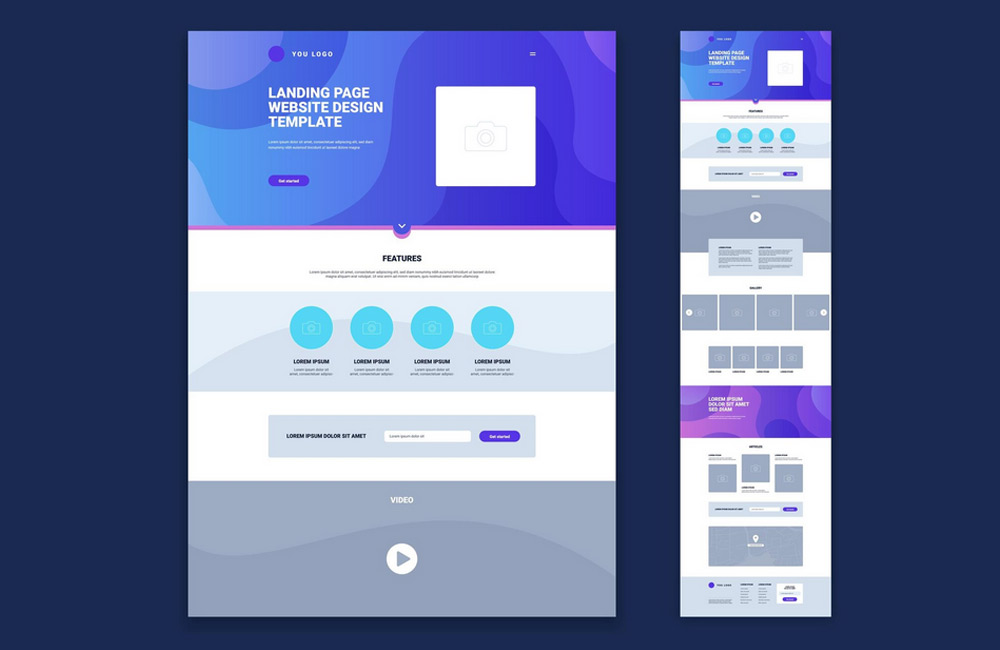
Image: freepik.com